Why finish matters before the first print run
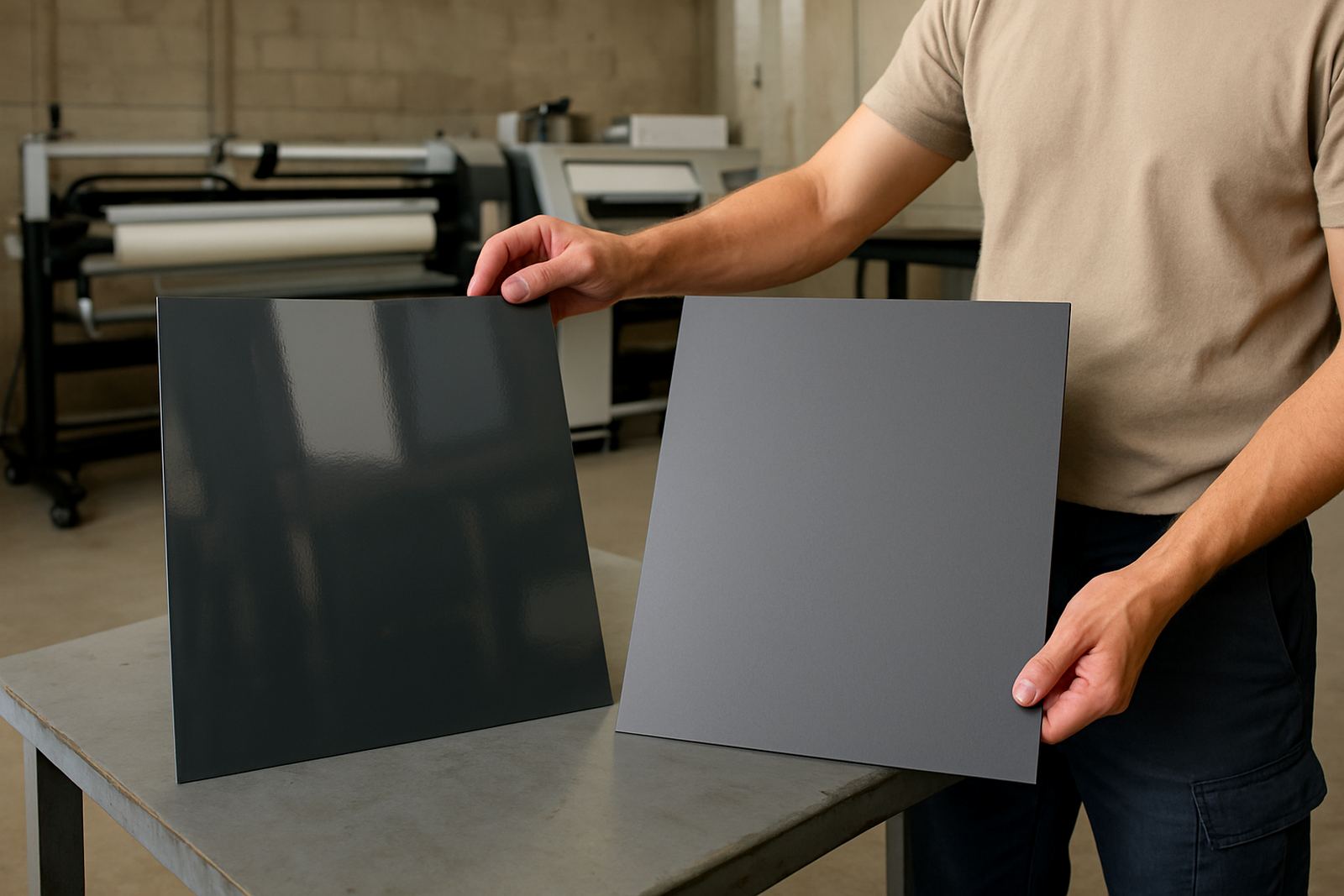
When clients ask for printed vinyl, the first question is often about colour and size. The finish matters just as much because it changes how the print behaves once it is installed on a wall, window, vehicle or board. A gloss finish reflects more light and usually gives stronger colour pop, while matte reduces reflection and helps text stay readable from more angles.
In Durban and the coastal belt, this is worth thinking through properly. Strong sun, humidity and salt in the air can all affect how a sign looks after installation, and a finish that suits one site may look wrong on another. A glossy wrap on a shaded indoor panel can look smart, but the same finish on a street-facing window may throw back glare and make the message harder to read.
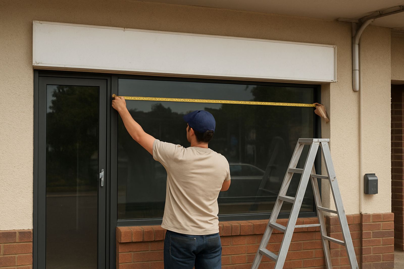
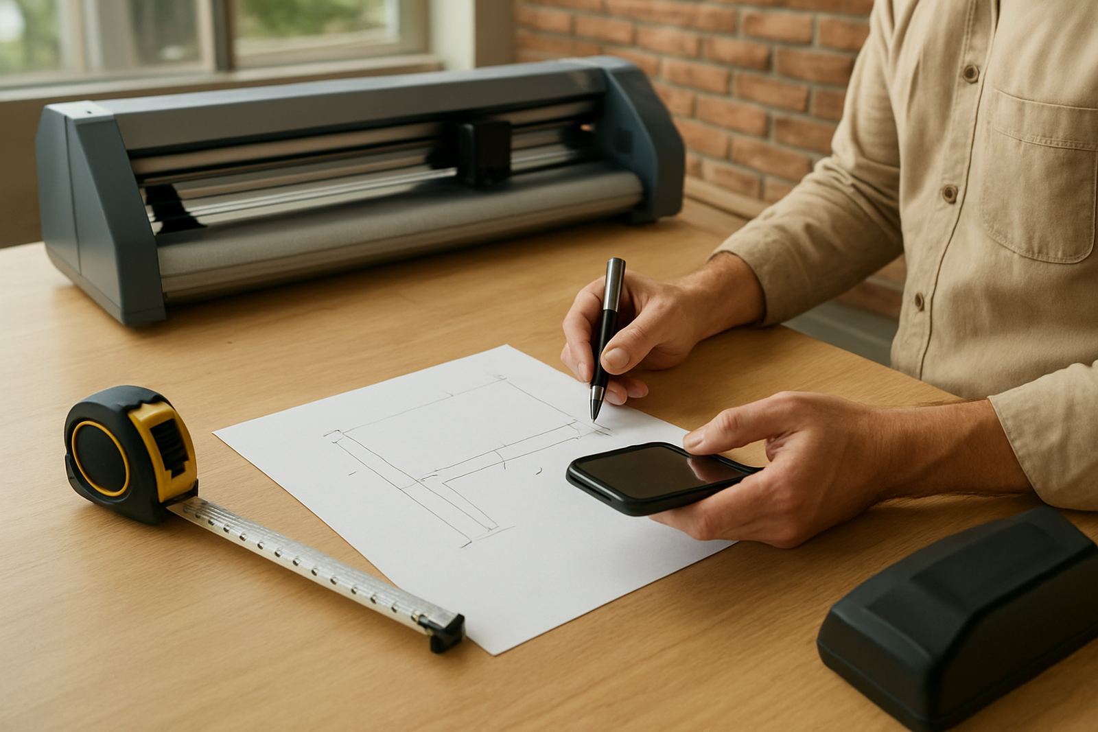
At BP Signs, the choice is made around the use of the sign, the viewing distance and the site conditions. That is where a proper site survey and artwork setup help, because the finish should work with the shape of the sign and the lighting, not against it.
Gloss finish for colour impact and easy cleaning
Gloss printed vinyl is usually the first choice when a client wants bold colour and a bright finish. It suits promotional panels, product graphics, retail branding and many vehicle markings where a lively appearance is part of the message. On a light box or a backlit panel, gloss can give the print a neat shine that looks clean in both daylight and evening use.
It is also practical for signs that need regular wiping. In busy areas such as shopfronts, forecourts and loading bays, a gloss surface is generally easier to clean without leaving the finish looking dull. That said, the shine can cause reflection, so the angle of the sign and the direction of sunlight must be checked first.
- Best for bold colour and eye-catching graphics
- Good for indoor retail signs and light boxes
- Useful where the sign may need regular cleaning
- Can show glare on windows or sunny facades
If a sign is meant to be seen quickly from passing traffic, gloss can work well, but only if the layout has enough contrast and the installation position is considered carefully.
Matte finish where reading speed matters
Matte printed vinyl is the better choice when readability matters more than shine. It cuts reflection, which makes it easier to read from different angles and in direct light. That makes it suitable for office walls, internal direction signs, conference graphics and window messages where people may stand close to the glass.
Matte also suits photographic prints and information panels where a softer look is preferred. It often feels more professional on internal branding because there is less visual distraction. For sites with bright strip lighting or afternoon sun, matte helps reduce the washed-out effect that can happen on reflective surfaces.
There is one important point though, matte can sometimes appear slightly softer in colour than gloss. If a design relies on very bright reds, blues or blacks, the proof should be checked before production. A small change in finish can alter how the brand reads from the road.
- Best for anti-glare reading indoors and near windows
- Suitable for directional signs and office graphics
- Often preferred for photographic and text-heavy designs
- Can look less shiny but more controlled
Coastal conditions, vehicle movement and load-shedding realities
Durban jobs are rarely done in perfect conditions. On the coast, moisture in the air can affect drying times and installation conditions, while inland areas can have more dust and heat during the day. For vehicle graphics, a finish needs to cope with vibration, washing and long hours in the sun. For shopfronts, the sign must still read clearly when the power goes out and the street lighting changes.
During load-shedding, a sign that depends on internal lighting will need to perform with natural light alone for part of the day. That means the printed face must still be legible without the glow behind it. Matte can help with external reading in some positions, but gloss may be better where a light box is used and the illumination level is strong enough.
At coastal sites from Umhlanga through to the North Coast, printed vinyl should be matched with proper lamination where needed. Lamination protects the print surface and helps the sign last longer, especially where the weather turns quickly or the installation is exposed to spray and wind.
Matching the finish to the sign type
Different applications need different thinking. A roll-up banner in a foyer does not behave like a shopfront panel on a road edge. A printed vinyl face on Perspex also reads differently from a frosted window graphic. The finish should suit the material, the lighting and the distance people will stand from the sign.
Here is a practical way to think about it:
- Shopfront graphics: Matte is often better for window copy, while gloss can work for bold display panels
- Vehicle signs: Gloss is common for impact, but matte can suit a more understated fleet look
- Light boxes: Gloss usually gives stronger colour when lit from behind
- Directional signage: Matte improves reading in direct sun and bright interiors
- Promotional banners: Gloss can help colour stand out at close range, especially for events
For wind-exposed areas or signs near busy roads, the finish also affects maintenance. A cleaner face stays readable longer, so the choice is not only about style but about how often the sign will need attention.
A local example from Briardene to Ballito
A small retailer in Durban North may want a front window graphic that cuts glare during the afternoon while still showing the brand clearly from the parking area. In that case, matte printed vinyl with carefully planned artwork can work better than a shiny finish. If the same business adds a light box above the entrance, the illuminated face may benefit from gloss so the logo carries better after sunset.
That kind of mixed use is common across eThekwini, Pinetown and the North Coast. One site may need a frosted internal privacy film at the same time as a printed external panel, and the finish choice should be made for each part of the job rather than treated as one decision. A good signmaker will look at the sun path, the viewing distance and the surface before cutting the first piece.
For clients in Briardene, Umhlanga, Westville, Phoenix or Tongaat, the practical part is simple: choose the finish that suits the site, not just the sample sheet. That saves time later and keeps the sign looking right for longer.
How BP Signs helps clients choose the right finish
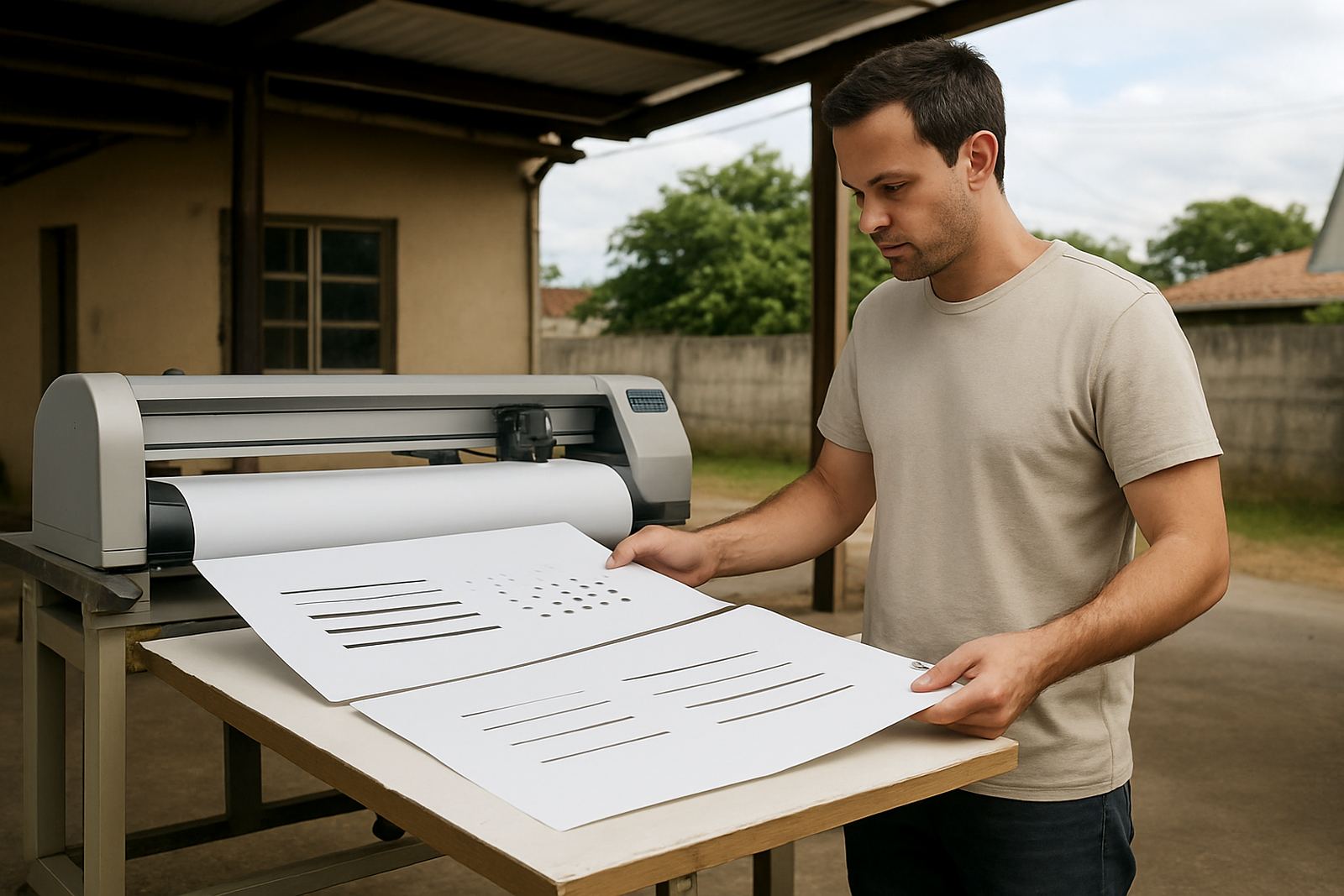
BP Signs handles the full process from site surveys and artwork setup through to print lamination, fabrication and installation. That means the finish is not chosen in isolation, it is matched to the actual sign, the actual site and the way people will see it each day. For a vinyl cut panel, a digital print, a shopfront installation or a vehicle graphic, the team looks at legibility first and finish second.
Our production and installation team works across Durban North, Umhlanga, Pinetown, Verulam, Westville, Phoenix and the wider KZN North Coast. That local experience matters because a sign that works in a shaded mall passage may fail on a bright roadside wall or a coastal facade. The right advice early on can prevent reprints, wasted material and awkward glare after installation.
If you need help deciding between gloss and matte for your next sign, the enquiry form on our contact page is the best place to start. We can assess the site, advise on the print finish and make sure the final result suits the way your business is seen.