

Why clinic wayfinding matters before a patient even checks in
People arriving at a medical practice are often worried, late, in pain or trying to help someone else. Good wayfinding reduces that pressure right at the entrance. It tells patients where to park, where to enter, which floor to use and where to wait, without making them ask three different people. That matters in busy Durban practices where morning congestion, lift queues and tight parking can all add to stress.
Clear signage also supports staff. Reception teams spend less time redirecting visitors, nurses are interrupted less often and patients move more naturally through the building. In a clinic, that is not only about convenience, it is about flow, privacy and safety.
- Use a sign hierarchy so the first message is simple: entrance, reception, waiting area, toilets.
- Keep wording short and direct. Too much text slows people down.
- Place signs where the eye looks naturally, not tucked above a doorway or behind a plant.
The signs that do the heavy lifting in a medical space
A clinic usually needs a mix of permanent and changeable signage. The basics include reception signs, directional arrows, room numbers, door names, toilet markers and safety notices. Many practices also need after-hours instructions, accessible parking markers and simple notice boards for visiting doctors or temporary changes.
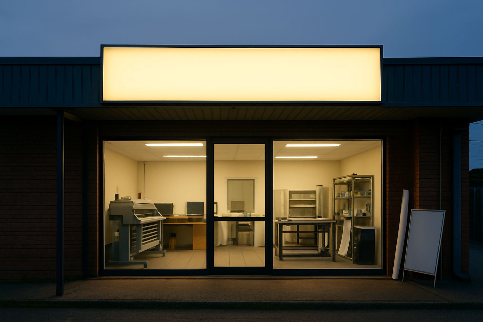
Materials matter too. In consulting areas, low-gloss finishes help reduce glare under bright lighting. In humid coastal areas like Umhlanga and Ballito, materials must handle moisture and regular cleaning. For entrances exposed to sun and salt air, tough substrates and quality print protection help signs last longer. Light boxes work well for entrance identification, while Perspex or ABS signs suit internal room markers and clean, professional branding.
- Reception and entrance signs for first contact points
- Directional signs for corridors, stairs and lifts
- Room identification for consulting rooms, treatment rooms and staff only areas
- Safety and compliance signs for fire exits, handwashing and restricted access
Design choices that help people feel calmer
Wayfinding is not only about arrows. It is also about tone. A clinic sign should be readable at a glance, with clear contrast, sensible spacing and lettering that can be seen from a standing position. Overly decorative fonts or crowded layouts slow the eye down and can make a place feel more hectic than it needs to be.
Colour coding can help when it is used consistently. For example, one colour for public areas, another for treatment zones and a third for staff only spaces. Keep the system simple so visitors learn it quickly. If a practice has several departments, use the same arrow style, the same wording pattern and the same naming convention throughout. A patient should never wonder whether "Room 4", "Consult 4" and "Treatment Suite A" are the same place, because that just causes confusion.
- Choose strong contrast, such as dark text on a light background or vice versa.
- Keep room names consistent from the parking area to the corridor.
- Use symbols sparingly and only when they are understood quickly.
Planning for real movement, not just a neat wall
Good clinic signage starts with a site survey. The route from parking to reception, from reception to waiting areas and from waiting areas to consulting rooms must be mapped properly. In older buildings, the shortest route is not always the clearest route. A sign may need to be placed earlier than expected so patients can decide before they reach a junction or stairwell.
For multi-tenant buildings in Durban North or Pinetown, shared entrances create extra risk of misdirection. Visitors may follow the wrong corridor, take the wrong lift or assume they have reached the clinic when they have not. In these spaces, entrance directories, door labels and building-level direction signs should work together as one system. If the clinic has separate pathways for private patients, casualty, deliveries or disabled access, those routes need their own clear markers.
- Check sightlines from the car park, gate, lift and reception counter.
- Identify pinch points where people naturally hesitate.
- Plan for visitors who arrive after dark or during load-shedding, when visibility drops.
Durability and hygiene in everyday clinic use
Medical spaces are cleaned often, sometimes several times a day. Signs must handle wipes, mild chemicals and repeated contact without peeling or fading. Lamination can help protect print in high-touch areas. For window graphics, especially in street-facing practices, contra-vision can give privacy while still allowing light through. Window frosting is useful for consultation rooms, treatment rooms and admin areas where privacy matters more than a full view.
In coastal parts of KwaZulu-Natal, moisture can affect finishes, fixings and vinyl edges if the wrong materials are used. In inland areas, dust and heat create other problems. That is why maintenance visits matter. A loose sign, a faded arrow or a damaged door label can quickly undermine the whole system. If a practice refurbishes a room or changes a department name, the sign set must be updated properly so the patient journey stays clear. This is one of those details people only notice when it is wrong.
A local example from Briardene to the North Coast
Consider a small specialist clinic in Briardene that sees patients from Durban North, Umhlanga and the KZN North Coast. On busy mornings, people arrive from different directions and many are first-time visitors. The practice needs external identification visible from the road, then a clean route from parking to entrance, then direct guidance to reception and waiting areas. Inside, room markers, toilet signs and a discreet staff-only zone keep movement orderly.
If the practice later adds a second consulting room or changes its patient flow, the signage should be adjusted without starting from scratch. That might mean replacing a directional panel, adding a frosted door graphic or updating a light box at the entrance. The point is not to create more signs than necessary. It is to make the right signs do the right work, every day.
- External signs help visitors identify the practice quickly from the street or parking area.
- Internal wayfinding keeps corridors clear and reduces repeated questions at reception.
- Refurbished or updated signs protect the practice image when services change.