Project brief for a busy Tongaat facility
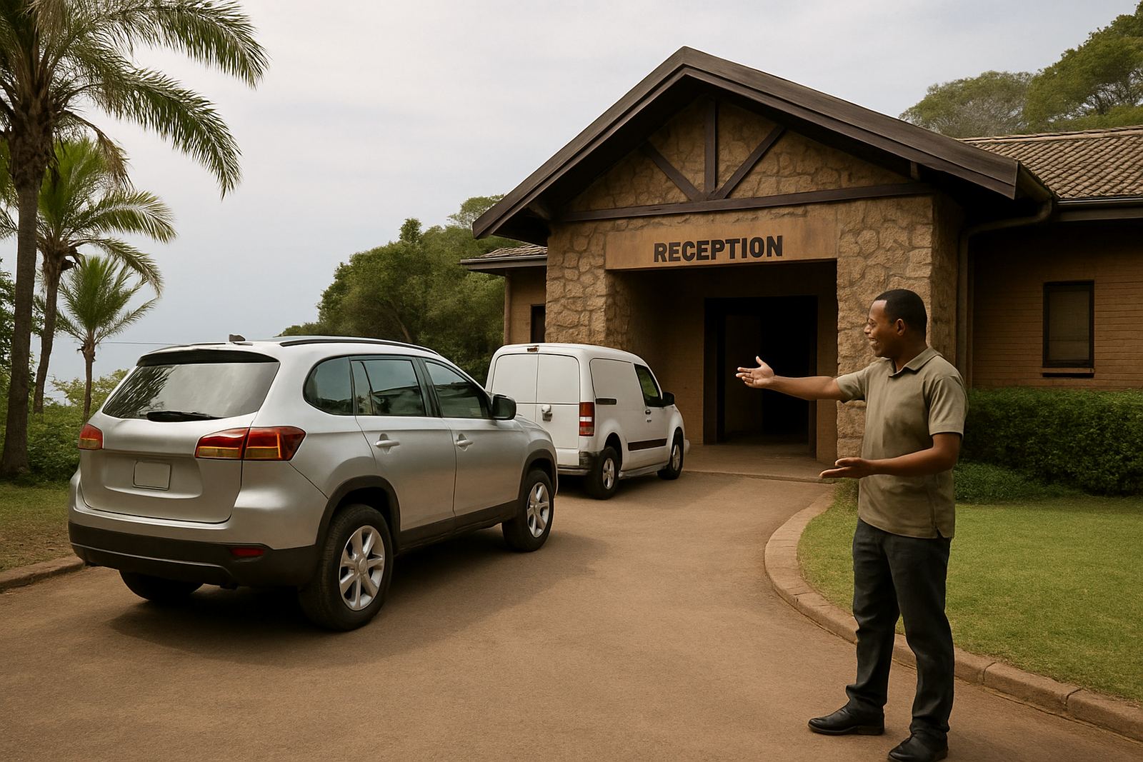
The client was a community facility in Tongaat that needed a proper signage refresh after years of mixed signs, handwritten notices and ageing labels. Visitors were often unsure where to go first, and staff needed room names and direction markers that stayed consistent across the site. The brief was straightforward: make the place easier to navigate and give it a cleaner, more organised feel.
Because the centre serves a steady flow of people, the signs had to be practical rather than decorative. We worked from the existing room list and circulation pattern, then mapped the most common visitor routes from the entrance, reception point and internal corridors. Bongani Patrick Zulu led the project with Nokuthula Mkhize coordinating the schedule, while Priya Govender prepared the artwork and Sashen Naidoo managed production. It was a local job, done with local conditions in mind.
Site conditions and installation constraints
We carried out a site survey before production so the fixing methods and sizes could be set properly. The building had a mix of painted walls, glazed areas and passageways with limited fixing space, so we had to balance visibility with safe placement. The facility also needed signs that would stay readable in bright daylight and under indoor lighting with no flicker during load-shedding.
Humidity from the KZN coast was another factor. In Tongaat, signs can warp or lose adhesion if the wrong material is used, especially near entrances and open walkways where moisture moves through the building. We also had to work around regular public movement, which meant installing in stages and keeping disruption low. One or two spaces were tight, so measurements had to be exact, otherwise the directional flow would have looked untidy.
- High foot traffic during the day
- Mixed wall surfaces and glass panels
- Coastal humidity and heat exposure
- Need for quick, low-disruption installation
- Clear visibility during power interruptions
What BP Signs supplied for the centre
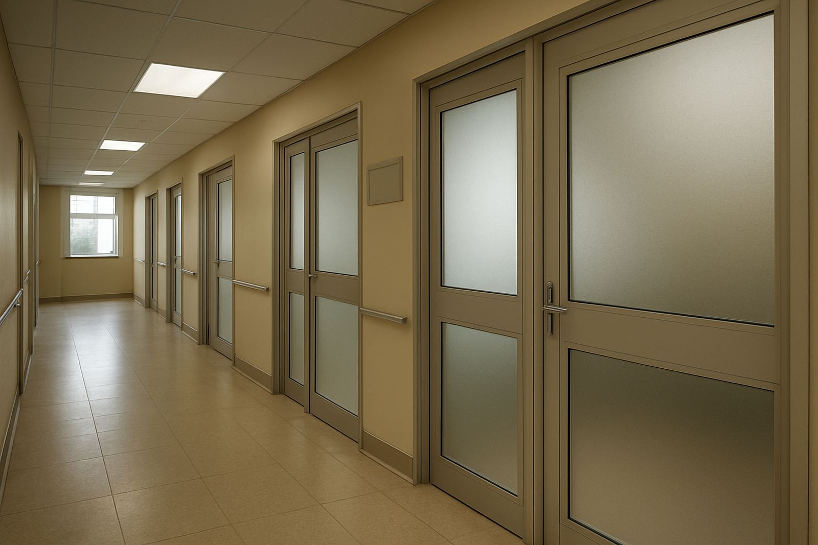
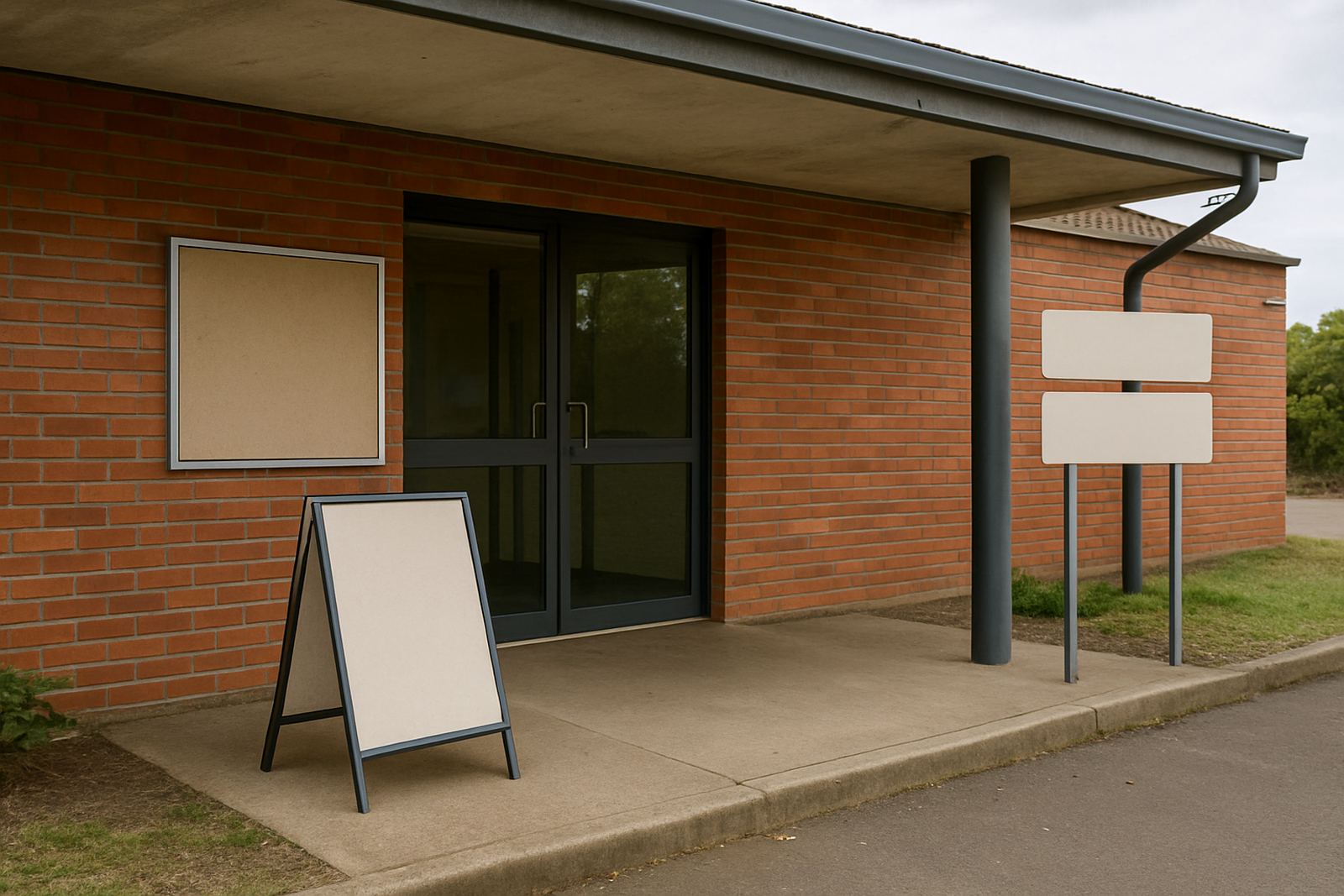
We supplied a combination of notice boards, directional signs and room identification plates. The main boards were produced with durable printed faces and protective lamination for easier cleaning. Directional signage was sized for quick reading at corridor distance, while room IDs were kept compact and neat so they could sit beside doors without crowding the space.
Materials were selected for the site use rather than for show. We used rigid substrates for the fixed boards, vinyl graphics for lettering and arrows, and clear mounting solutions where the facility needed a lighter visual touch. The end result was simple, legible and easy for staff to maintain. No complicated finishes, just signs that did their job properly.
- Notice boards for public information and announcements
- Directional arrows for entrances, corridors and key rooms
- Room identification signs for offices and service spaces
- Printed graphics with laminated protection
- Fixings chosen for wall type and long term hold
Production, checks and installation over three weeks
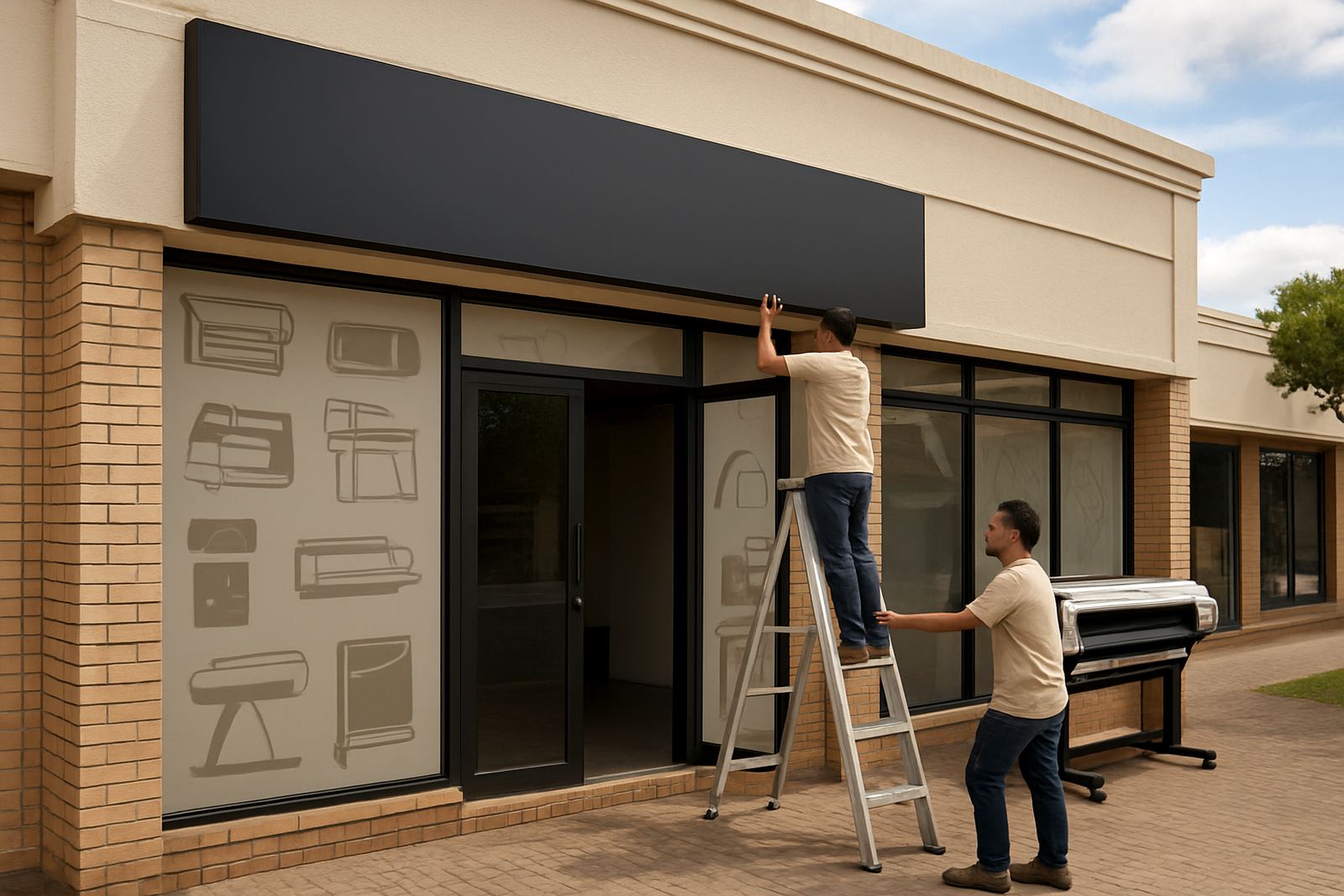
The project moved from survey to final install over three weeks. Week one covered measurements, artwork setup and approval of the wording layout. Week two was production, which included print preparation, cutting, lamination and board finishing. Week three was installation on site, with the team fitting each piece in sequence so the building could stay operational.
Anele Dlamini led the installation work and checked each position against the route plan before fixing anything permanently. That saved time on site and reduced unnecessary holes in the walls. Sashen kept an eye on finish quality in production, and Lindokuhle Khumalo handled client coordination so there was always one clear contact point. The job went in cleanly, and the final placement matched the intended visitor flow.
- Week 1: survey, measurements and artwork setup
- Week 2: printing, cutting, lamination and fabrication
- Week 3: staged installation and final checks
- Sign positions checked against foot traffic and sight lines
What improved after the signs went up
Once the signs were in place, the centre became easier to read at a glance. Visitors could find the right rooms faster, staff spent less time giving directions, and the notice boards gave the building a more orderly feel. The change was practical more than flashy, which is exactly what this type of facility needs.
We also designed the set to be easy to update. If room names change or a board needs replacing later, the format can be repeated without starting from scratch. For a community site that serves many different users, that matters. The signs need to stay useful after the first week, not just look good on the day of install.
What we would repeat on the next similar project
If we were doing the same type of facility again in Tongaat or anywhere in eThekwini, we would take the same approach. Start with a proper site survey, agree the room list early, and install in stages so the venue keeps working during the process. That method cuts down on rework and makes the final layout easier for staff to use.
We would also keep using materials suited to coastal KZN, especially for signs near doors and public walkways. Durability matters in this part of Durban North and the North Coast, not just in the workshop but after months of sun, moisture and cleaning. That is where practical sign making counts, and it is the same approach we use for Durban North Signs, Umhlanga Signs, Pinetown Signs and the other areas we service.
Key facts
| Project type | Community facility signage upgrade |
|---|---|
| Town | Tongaat, KwaZulu-Natal |
| Scope | Notice boards, directional signs and room identification |
| Materials | Rigid boards, printed vinyl, lamination and adhesive graphics |
| Timeline | 3 weeks from survey to installation |
| Installation | Staged on site fitting with final alignment checks |