Start with the viewing distance, not the artwork
Many sign problems begin before the design is even set. A sign that looks fine on a computer screen can disappear once it is mounted above a busy road, behind parked cars, or high enough that drivers only get a second or two to read it. In Durban and the North Coast, where traffic moves fast and buildings often sit back from the road, the viewing distance matters more than people expect.
Before artwork is approved, measure the frontage, the height available, and how far the nearest driver or pedestrian will be when they first see the sign. A small fascia panel can work for a quiet side street, but it will struggle on a wider road in Umhlanga or along a commercial strip in Pinetown. At BP Signs, site surveys are worth doing early because the same layout can fail in one location and work well in another.
Text that is too busy for a moving audience
One of the most common mistakes is trying to say too much. When a shopfront sign carries too many words, too many phone numbers, or several lines of services, it becomes hard to read in motion. The result is a sign that looks full, but does not perform. Drivers will not stop to work it out, they just keep going.
Keep the main message simple. The business name should be the strongest element, followed by a short descriptor if needed. Anything extra can go on the window graphics, a side panel, or inside the store. If the layout is crowded, it usually means the sign is being asked to do two or three jobs at once. Better to separate the messages and keep the street-facing sign clean.
- Use one main brand name per sign face
- Keep service lists short and selective
- Avoid stacking too many fonts or bold effects
- Leave enough open space around the wording
Wrong proportions for the sign board or fascia
A sign can be the right colour and still look wrong if the proportions are off. Letters that are too small for a long fascia get lost. Letters that are too large can crowd the panel and feel heavy. The same applies to logos, borders and background shapes. Good proportion is what makes a sign feel balanced from a distance, not just up close.
For shopfronts in Briardene, Durban North and Umhlanga, fascia boards are often fitted between roller shutters, parapets or existing trim lines. That means the sign has to fit the building, not fight it. If the panel is narrow, use fewer elements. If the frontage is wide, do not waste the space with tiny wording in the middle. The eye should know where to land straight away.
It also helps to think about scale in metres, not just in pixels. A 3 m sign face with 50 mm letters may be too small for passing traffic, while a larger frontage may need much bigger lettering to hold its own. The right size is not guesswork, its a calculation based on distance and speed.
Materials that look fine on day one but fail in the weather
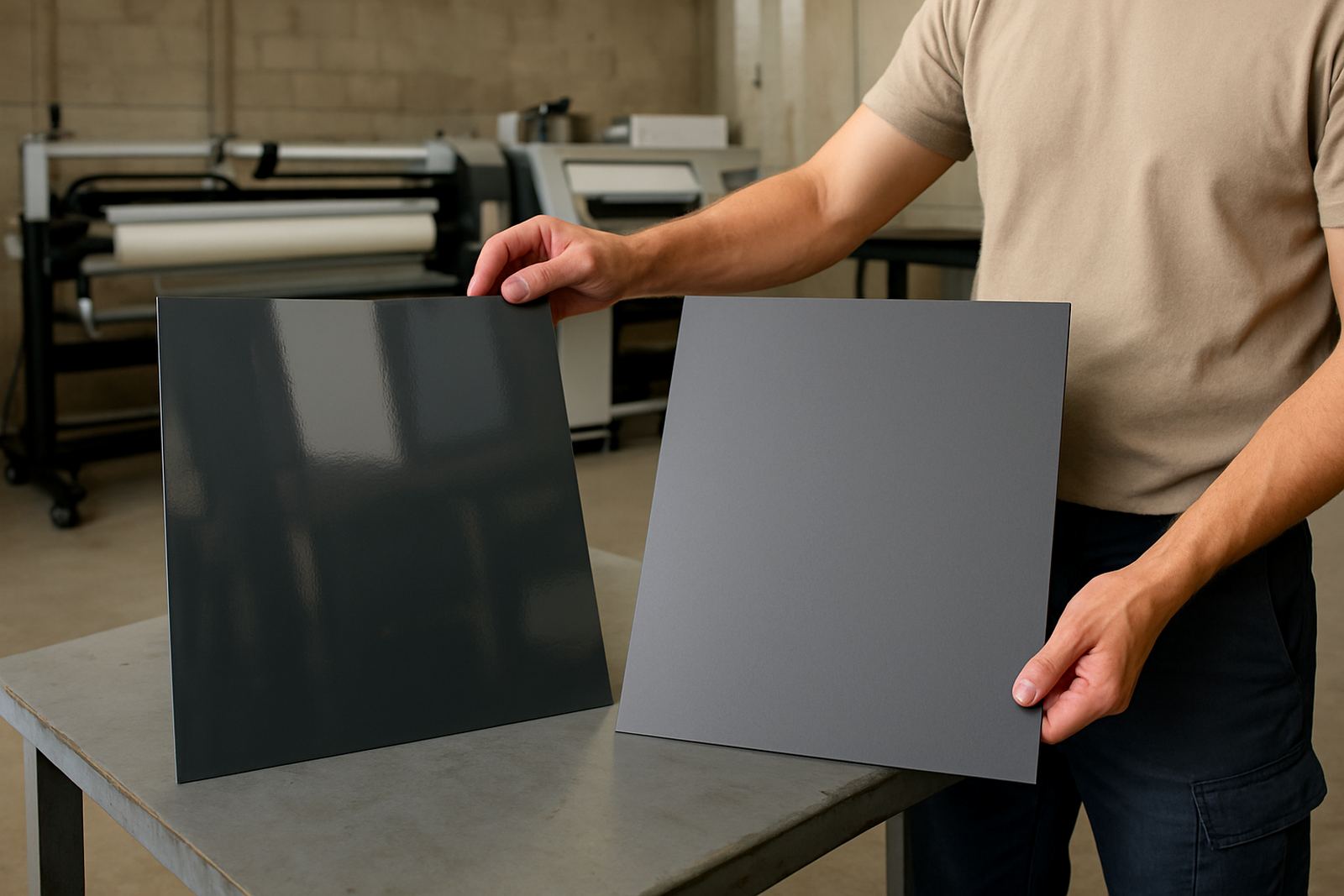
Durban weather is hard on signage. Coastal humidity, salt in the air, strong sun and summer rain can all shorten the life of a poor material choice. A shopfront sign may look neat after installation, then start warping, fading or lifting after a few months if the substrate and print system were not chosen correctly.
For exposed shopfronts, the material should suit the site. Some boards are better for flat painted finishes, some for printed graphics, and some for illuminated faces. If the frontage catches direct coastal air, fixings and sealants matter too. Loose edges, moisture behind panels and poorly finished joins are common causes of early failure. In areas near the coast, even a small detail like an unsealed cut edge can become a problem.
- Choose materials that suit the weather and the mounting position
- Seal cut edges where moisture may enter
- Use fixings that can handle wind and heat
- Check whether illumination or backlighting changes the material choice
Lighting that leaves the sign unreadable after dark
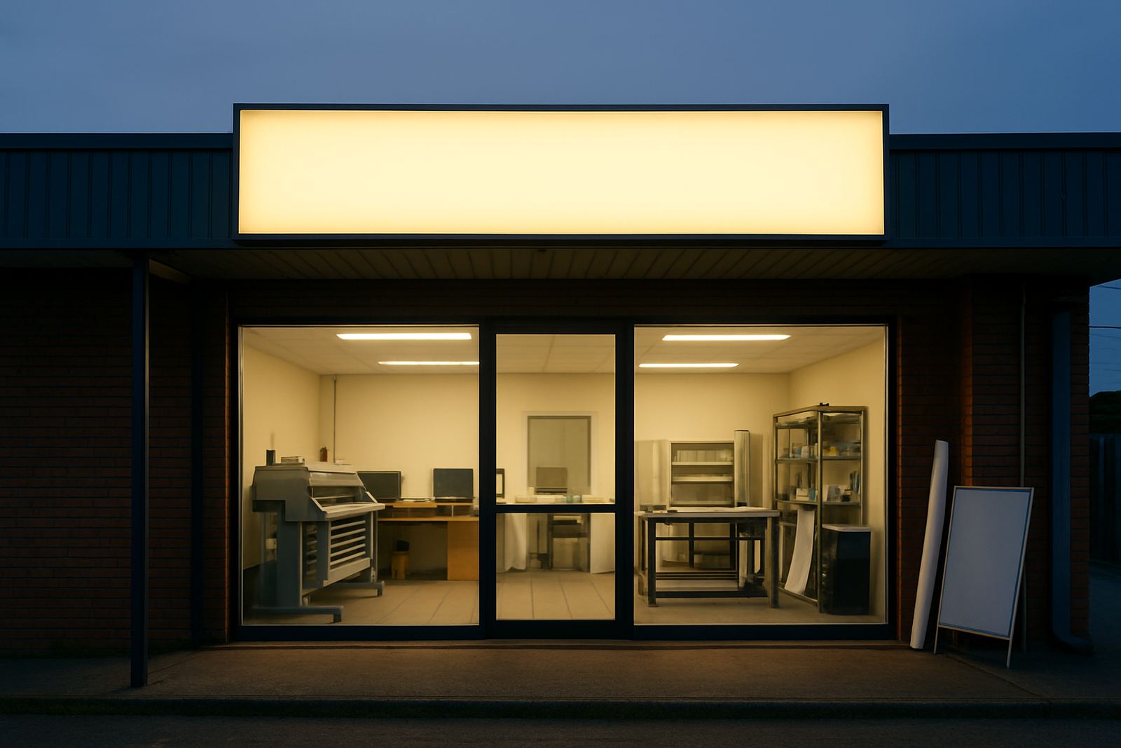
A sign that works in daylight but disappears at night is half a solution. This is a frequent issue for restaurants, salons, pharmacies and retail shops that trade into the evening. If the light box is too dim, uneven, or badly positioned, the lettering may wash out instead of standing out. The same problem happens when reflective surfaces create glare.
Lighting should support the sign rather than overpower it. A well-made light box needs even brightness across the face, with no hot spots or dull corners. If the sign is not illuminated, nearby security lights and street lights should still allow it to be read from the road. For premises in busy centres like Westville, Phoenix or Ballito, evening visibility can be just as important as daytime presence.
Load-shedding also needs to be considered. If a shopfront depends on light to be seen, there should be a practical backup plan so the business is still visible when power is off.
Ignoring windows, doors and the rest of the frontage
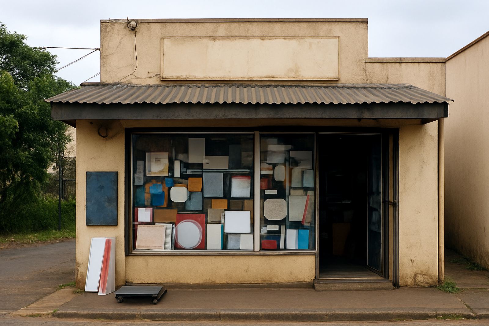
Another mistake is treating the sign board as the only part of the frontage that matters. In truth, the whole shopfront works together. Windows, doors, shutters and side panels all affect how the sign is viewed. If the main sign is good but the windows are cluttered, frosted poorly or covered in mismatched graphics, the frontage loses impact.
Window frosting and contra-vision can help with privacy, branding and sun control, but they need to be planned with the rest of the layout. A common error is placing too much vinyl on the glass so the interior feels dark and the exterior looks heavy. Another is installing graphics that block the view of the entrance and make the shop look closed when it is open.
At BP Signs, sign fabrication, window installation and shopfront installation are best handled as one scope when possible. That way the final result is consistent, practical and easier to maintain.
A Durban North example that shows the difference
One retail client near Durban North wanted a fresh fascia and window graphics for a narrow frontage facing steady traffic. Their first idea was a long list of services, a large logo and several contact details on one board. From the road it looked crowded, and the lettering would have been too small to read at speed. The frontage also had afternoon sun and strong reflected light from passing vehicles.
After a site survey, the layout was simplified. The main business name was kept large, the services were moved to the windows, and the sign face was adjusted for better proportion. Window frosting was used to manage glare and give the entrance more privacy, while the printed elements stayed clear and easy to read. The result was not flashy, just legible and suited to the street. That is usually what makes a shopfront sign work best.
If a sign is hard to read from across the road, it has already lost. Good signage should answer quickly: who you are, where you are, and whether the customer should slow down.